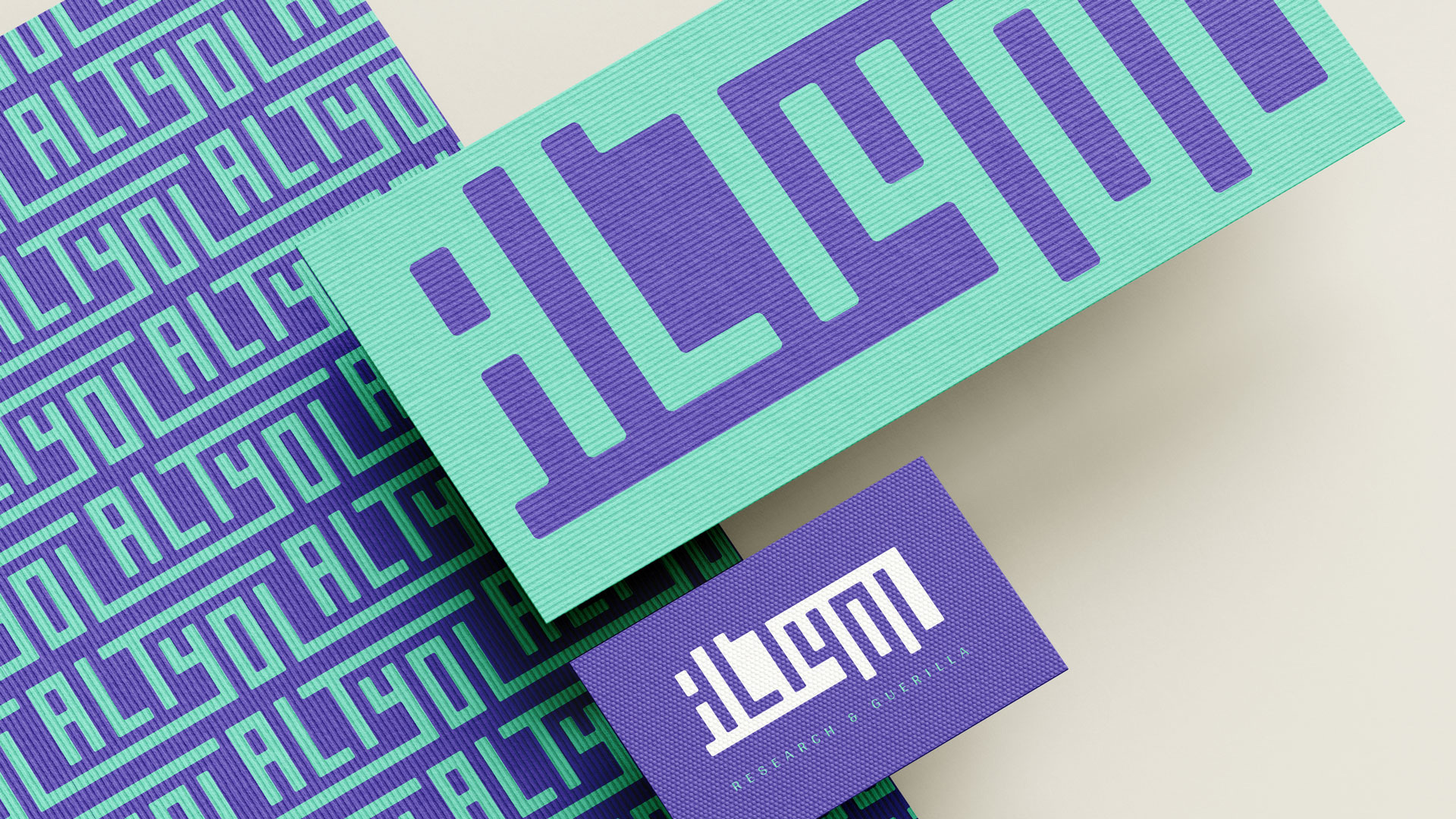
We developed this corporate identity for Altyol with a truly "out of the box" approach. Literally taking inspiration from the space outside the box, we designed a logo that cleverly utilizes negative space wherever it resides.

We treated the space around the letters as part of the design. The name emerges from the gaps, inviting a different way of reading the logo. Purple and mint make the relationship between the lettering and its background more visible.
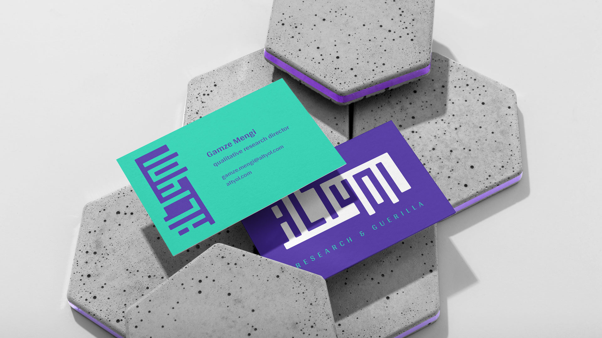
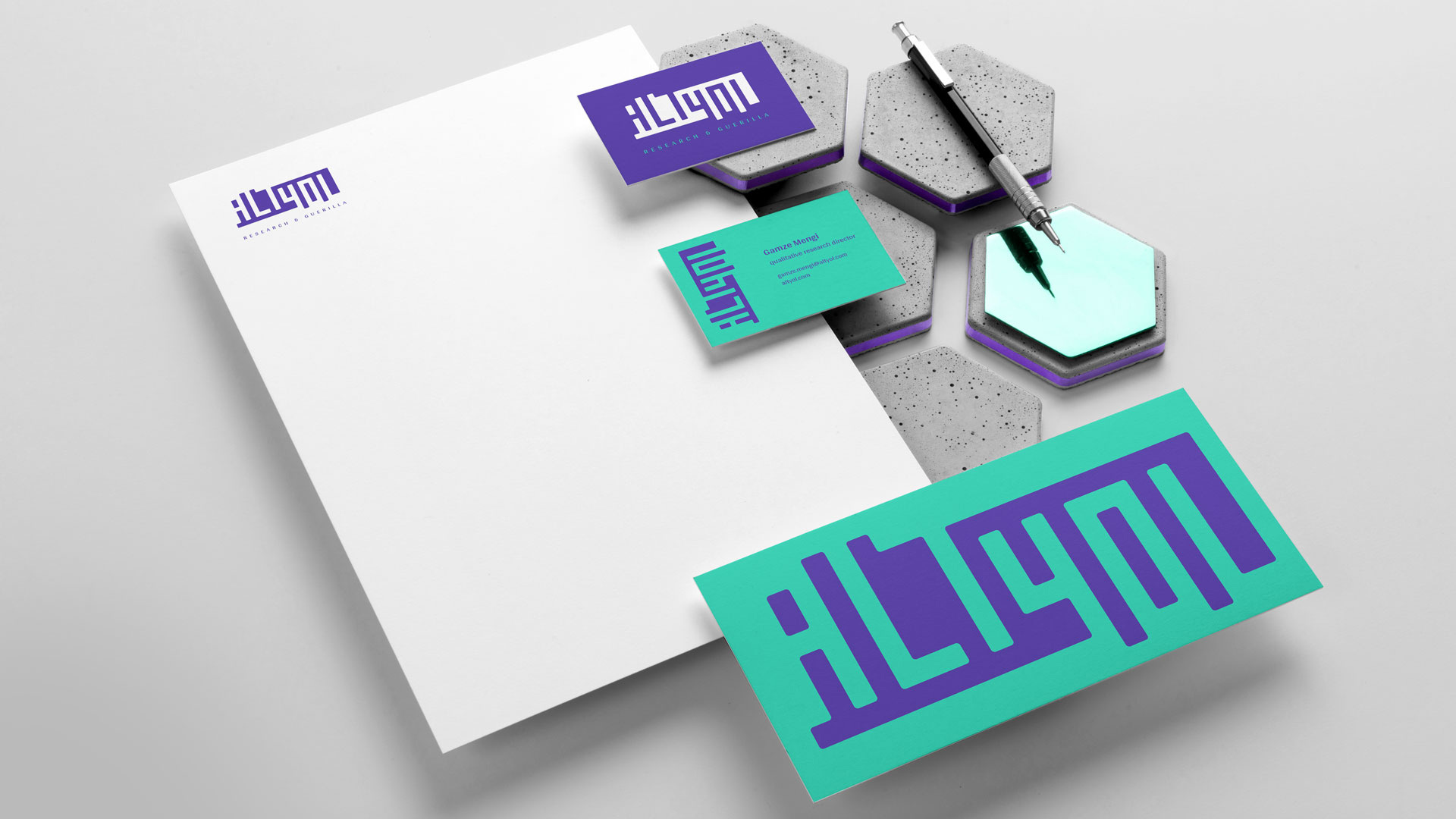
The same idea continues across the stationery. By switching colours and changing scale, we explored different ways of using the mark while keeping its geometric structure consistent.
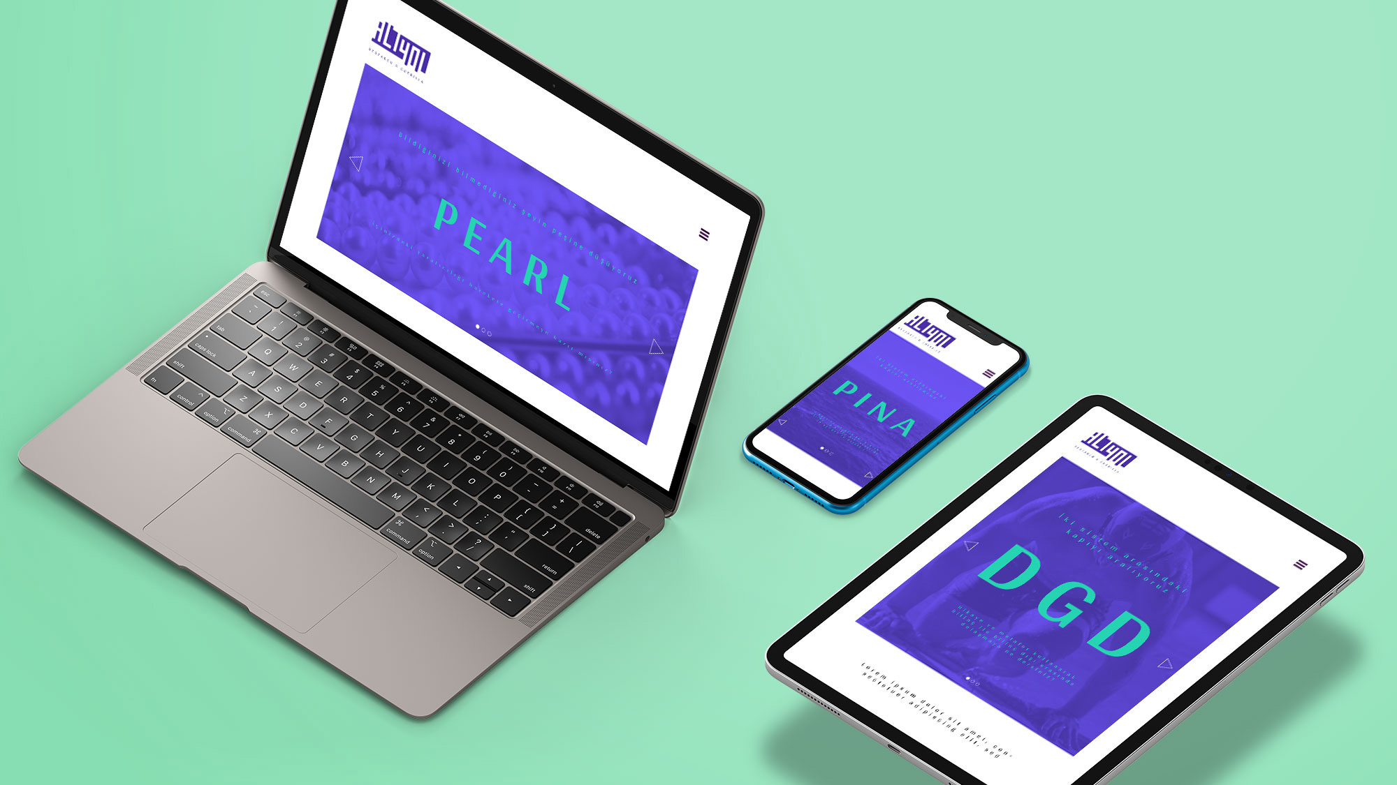
On screen, the negative space becomes a window for moving images. The surroundings become part of the identity, allowing the logo to change with what sits behind it.
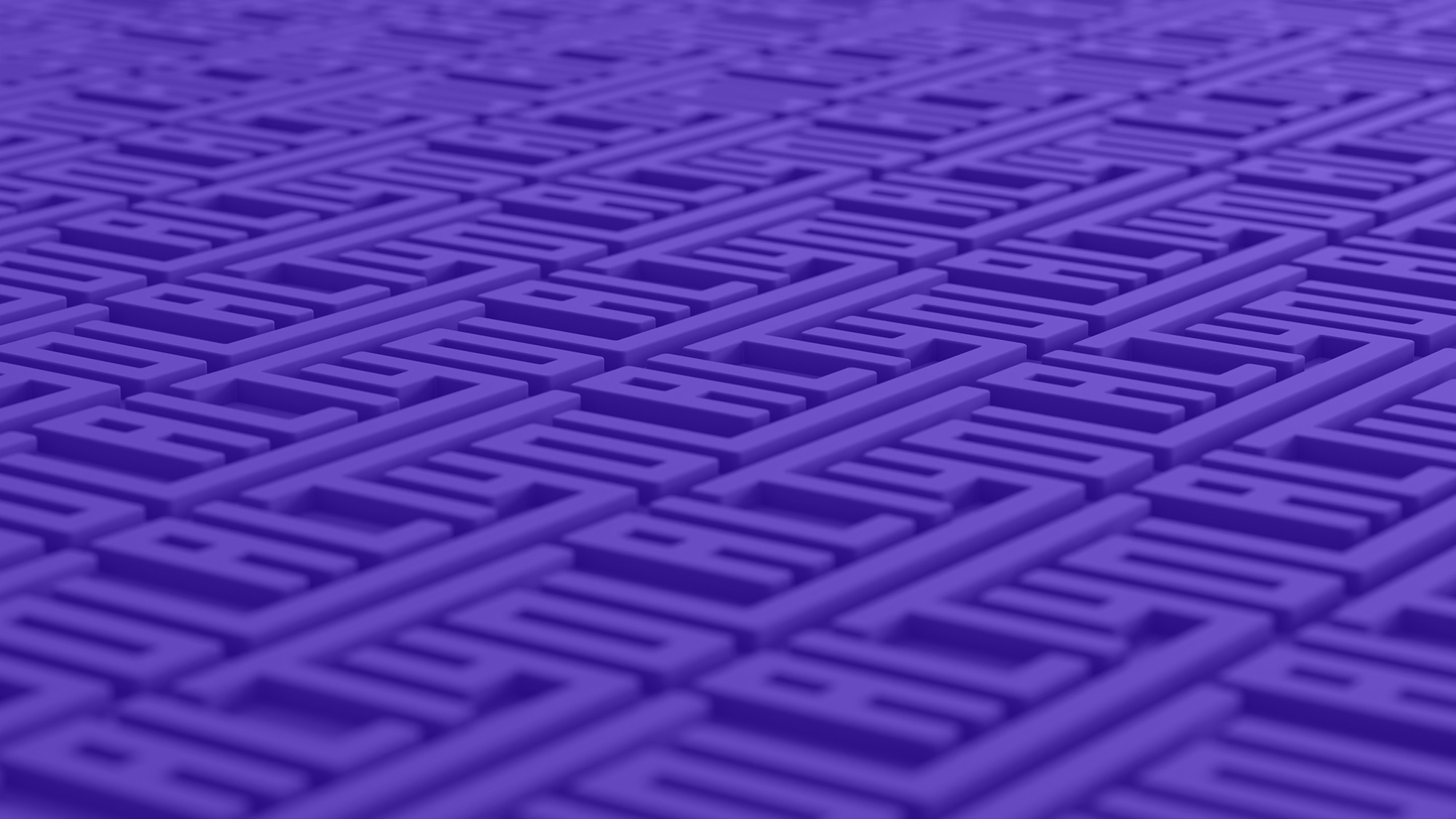
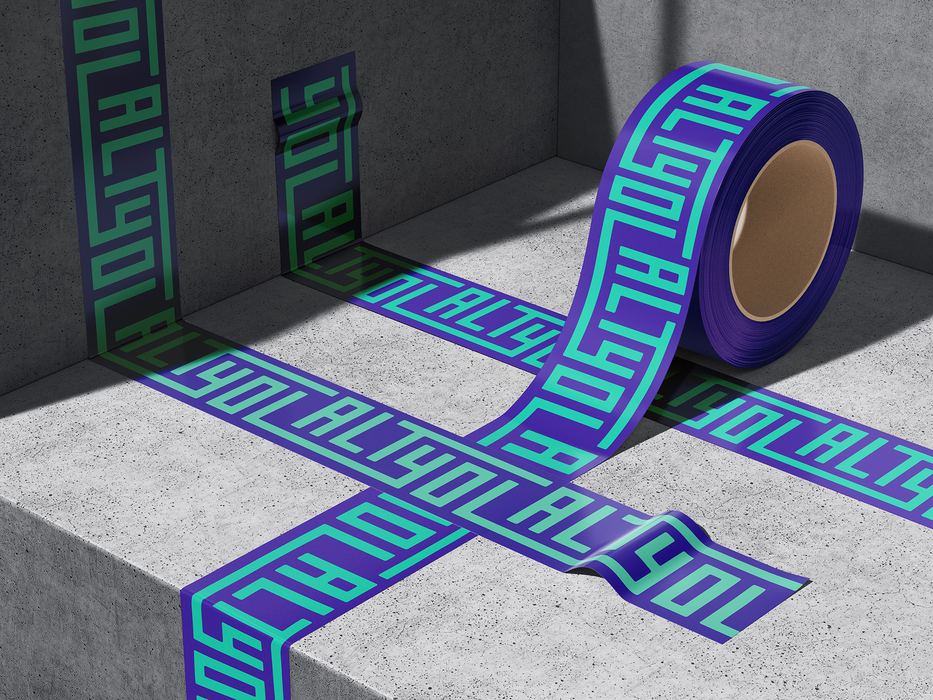
We also repeated the logo to create a pattern, letting its lines connect into a network of paths. Applied as a surface, a relief or a strip of tape, the lettering becomes a graphic element that extends beyond the name.