
Mukto found by Meriç Altın in 2012, designing free and coincidental jewelry forged with metal, fire and the soul. The logo involves ''The man blowing his own fortress'', a story about the man who reconstruct himself over time and experience. He made two rings on this story and had a logo he wanted to change.
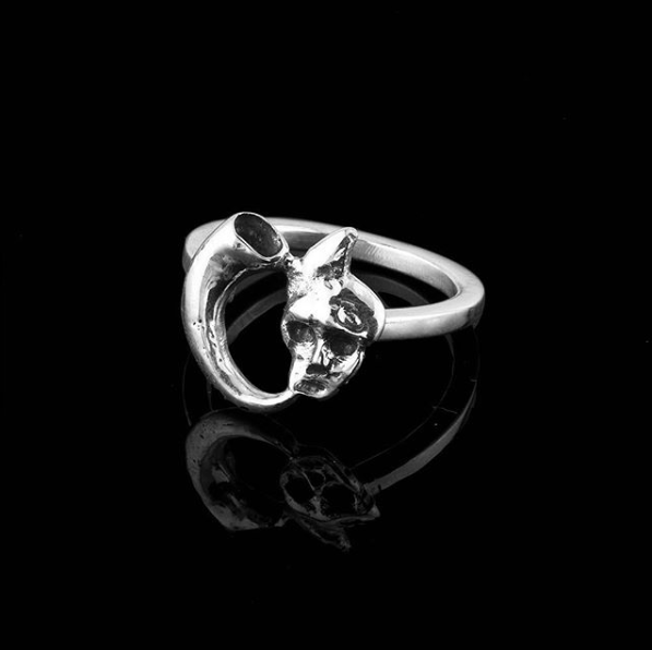
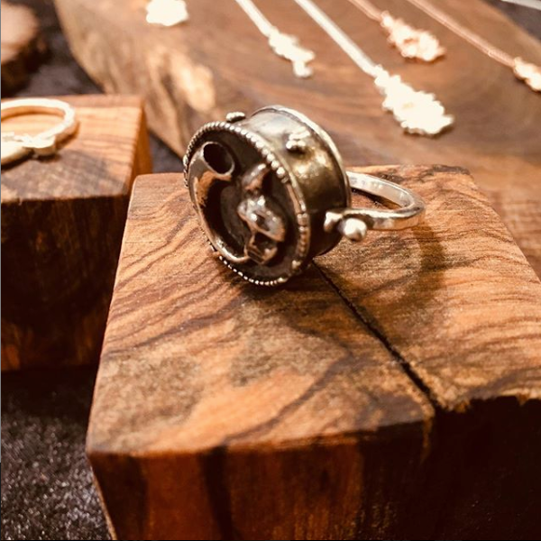
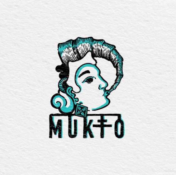
While designing new projects Meriç starts with the material. Taking it in hand and looking at it trying to figure out what it needs to be in it's new life. We recreated this figure as if it's a single line of metal in Meriç's hands. Bended and twisted into a new story from it's existing form. And used it in our new branding and packaging design.
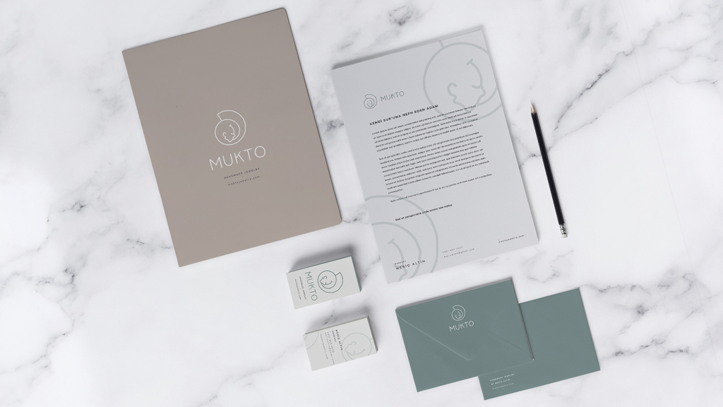
We paired the fine lines of the symbol with light typography and a palette of muted green, warm grey and off-white. Generous spacing carries the same quiet approach through the stationery, leaving room for the details of the mark.
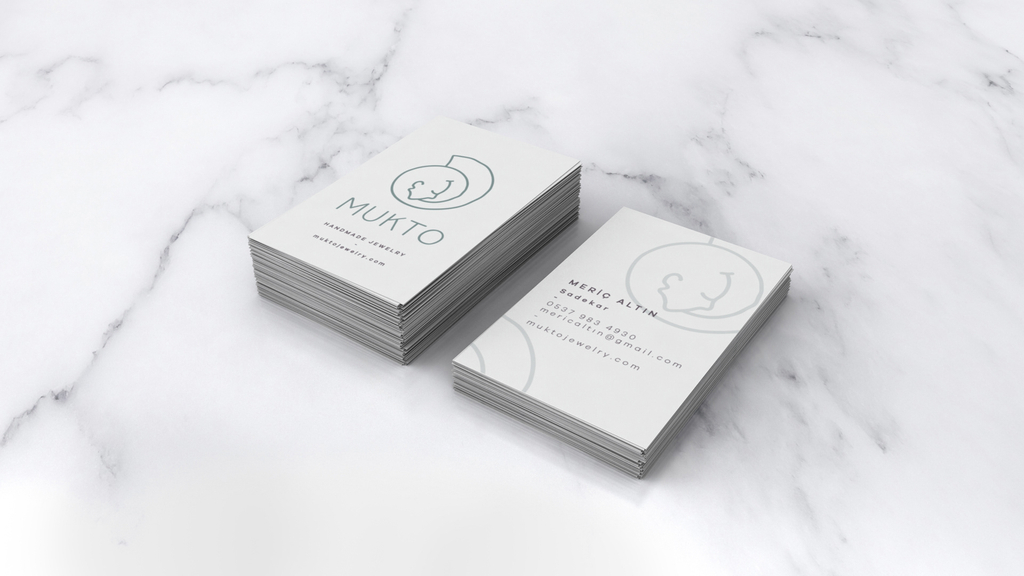
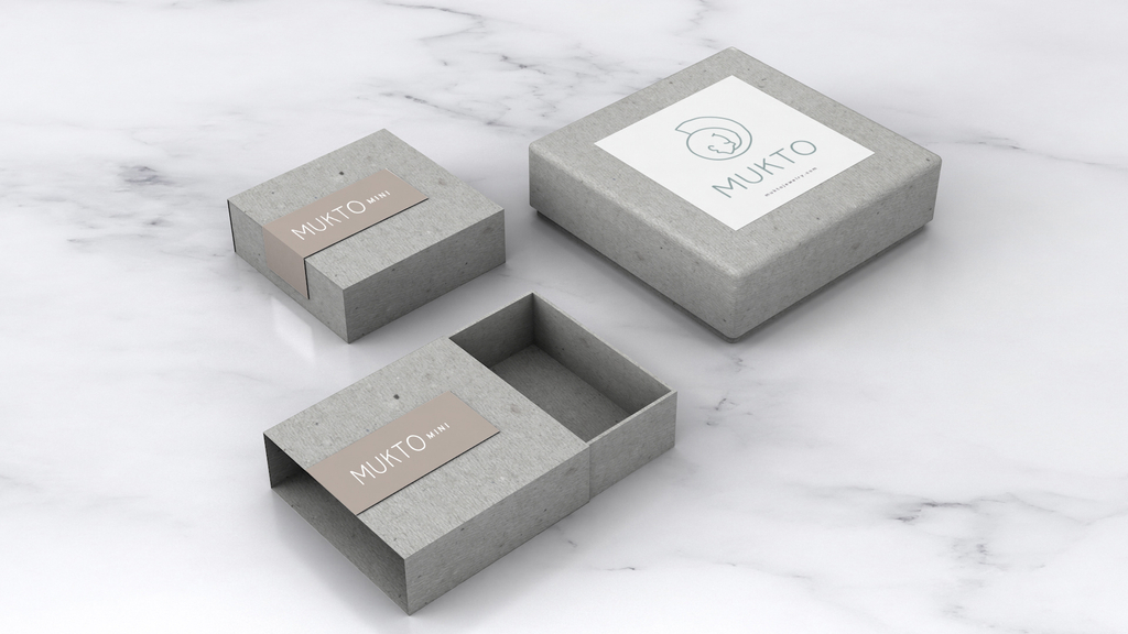
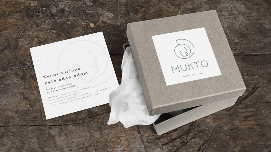
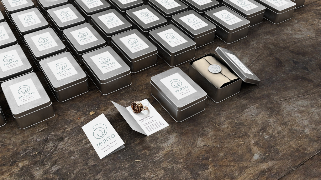
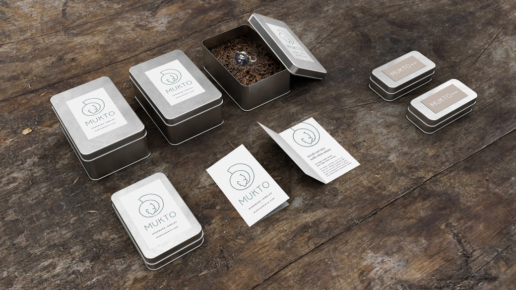
For the packaging, we combined textured grey boxes with simple printed labels. The materials continue the natural feel of the jewellery, while the layout keeps the name and symbol together across different box sizes.
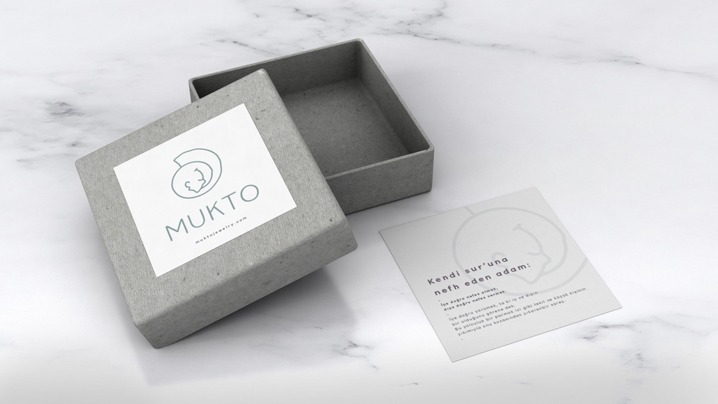
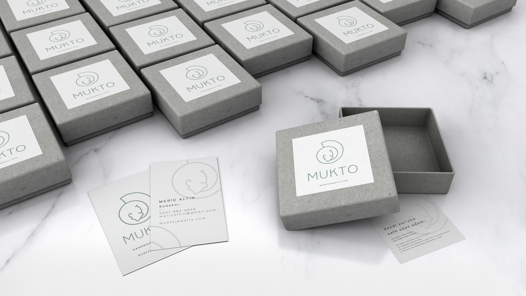
The message “You are always at home in yourself” continues on the cards placed inside the boxes. We used an enlarged, softly printed version of the symbol alongside the text, carrying the idea behind the jewellery into the unboxing.
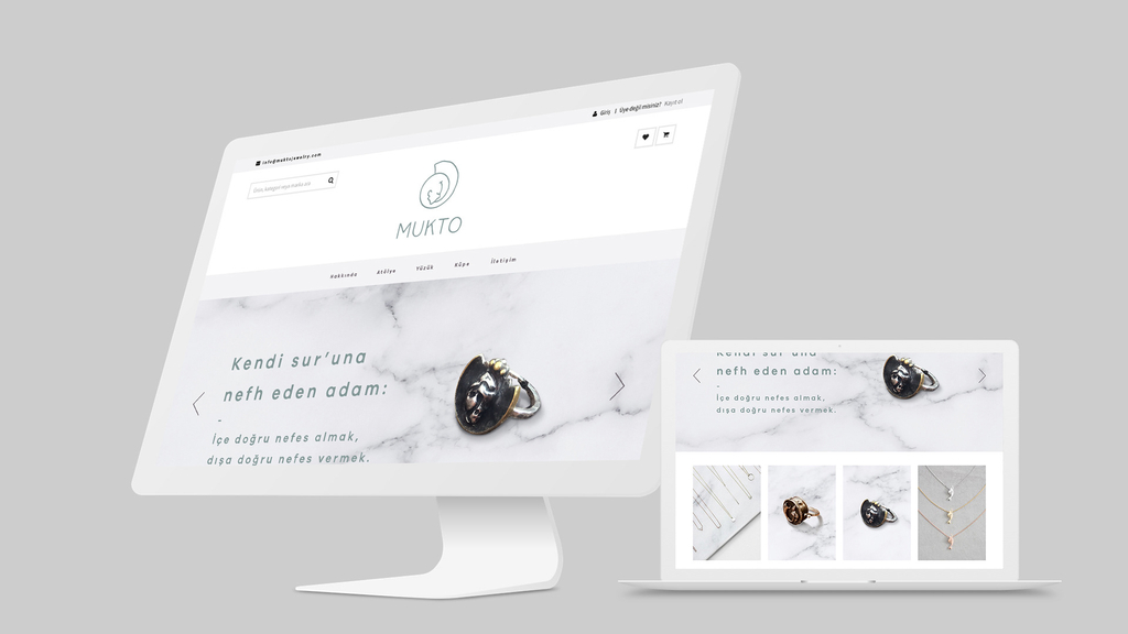
We extended the identity to the website with pale backgrounds, restrained typography and space for product photography. The jewellery and its organic forms remain the focus, with the brand’s colours and linework connecting the pages.