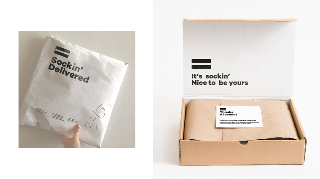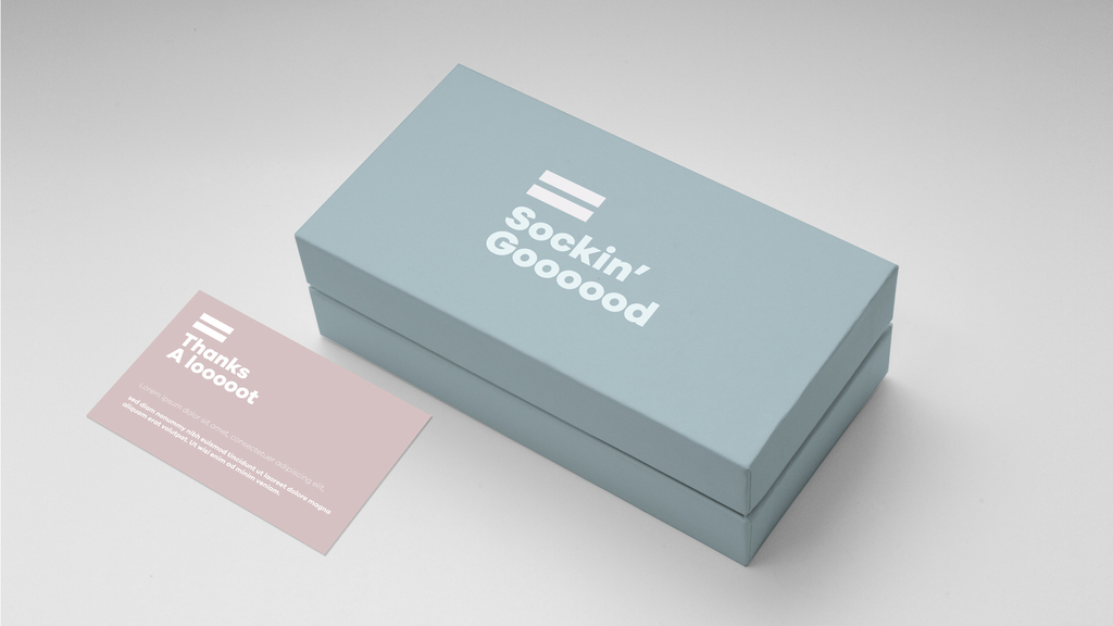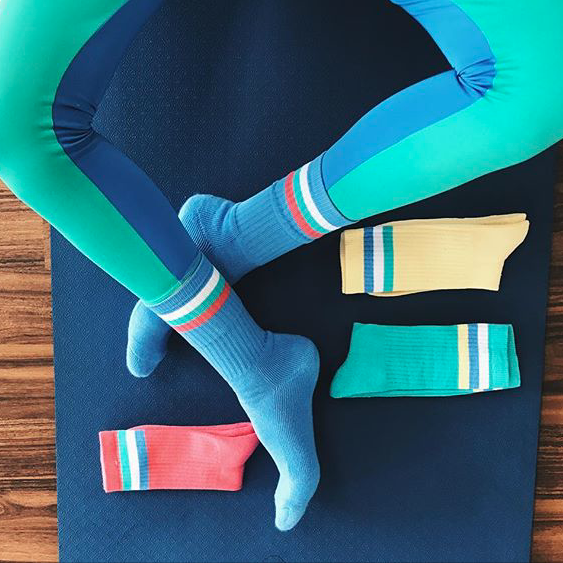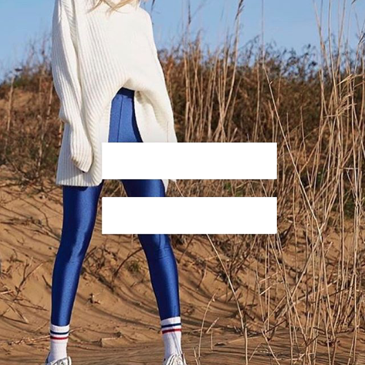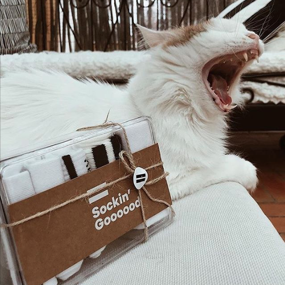
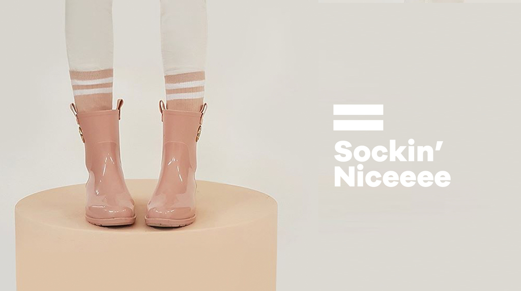
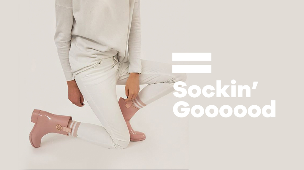
For Sockin’ Good, we created a playful brand identity that takes its cue from the product itself. A striped sock became the starting point for the logo, with a pastel palette setting the tone for the wider brand.
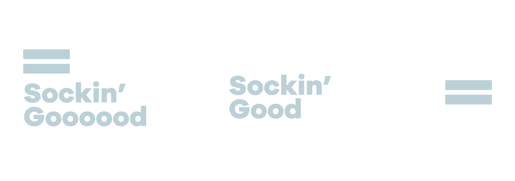
Two horizontal stripes sit above the stacked lettering, forming the silhouette of a sock. The words extend to suggest the foot, while the stripes mark the cuff.
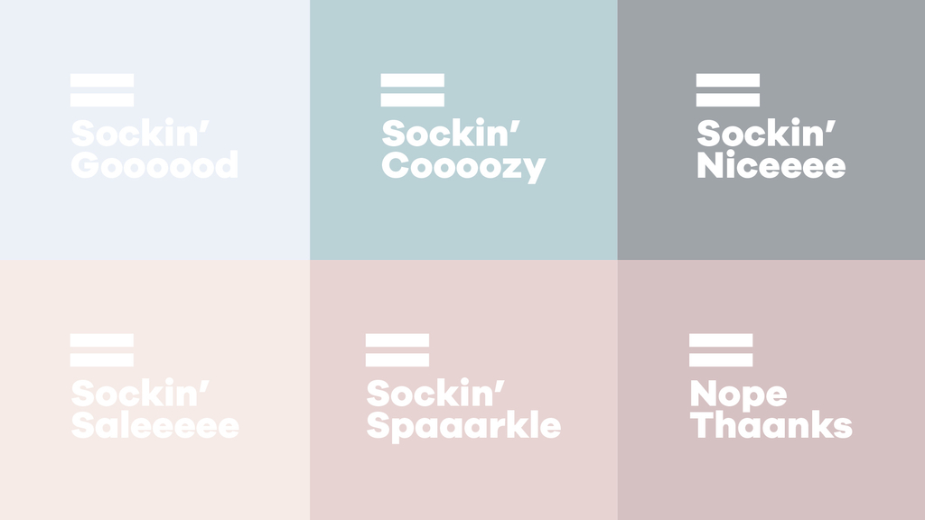
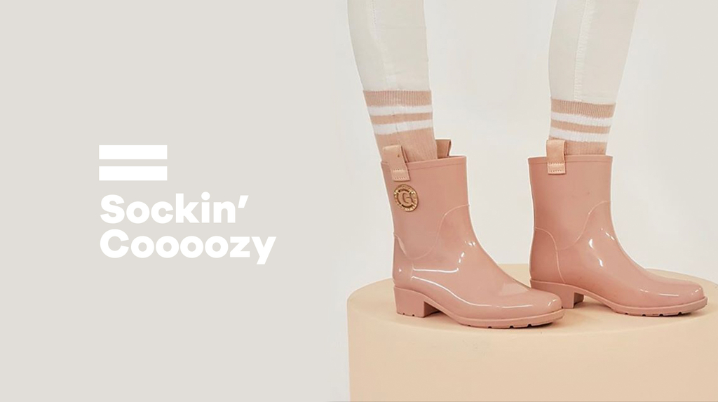
We let the wording change with the mood. “Sockin’ Goooood,” “Sockin’ Cooozy” and “Sockin’ Niceeee” share the same structure, stretching out the words to give the brand a casual, conversational voice. Soft blues, pinks and muted neutrals bring these variations together.
The same tone continues through the packaging, from “Sockin’ Delivered” on the mailing bag to a greeting inside the box. We kept the layouts simple, using the stripes, short messages and blocks of pastel colour across the different materials.